7 Tricks to Increasing Your Conversion Rate On Your Website
If you’ve been receiving a high volume of site traffic but aren’t seeing an increase in new subscribers or interested customers, you may have a conversion problem. If that’s the case, focusing on conversions could actually be more beneficial than trying to increase traffic any further.
After all, if you’re sending new traffic to a website that isn’t fully optimized, you’re letting potential business leads slip through the cracks.
Optimizing your website doesn’t have to be an incredibly time-consuming affair either. By implementing a few of seven simple tricks below, you can make your website more attractive to your visitors, boost conversion rates and profit as a result.
1. Use Simple Language
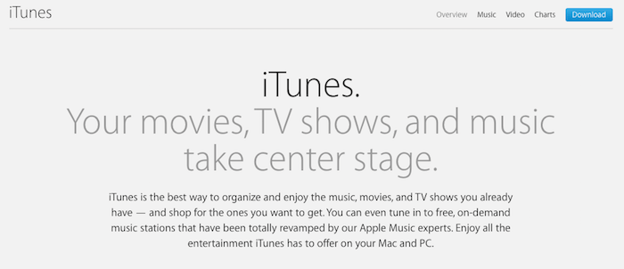
Clarity is king when you’re looking to persuade. If your website copy is stuffed with jargon, you’re not doing your visitors any favors.
Don’t write for companies. Don’t write for experts in your field. Don’t write to show off your expertise. Write for customers who are going to buy your product. Write for real people.
[Tweet “Don’t write for companies. Don’t write for experts in your field. Don’t write to show off your expertise. Write for real people.”]
A good rule of thumb is to write as if you’re writing to a five year old. This has nothing to do with intelligence or comprehension levels, it’s simply a useful trick that forces you to break things down in a clear and coherent manner.
If you wouldn’t use a certain word or phrase in regular conversation, cut it out or reword the sentence.
2. Make Your Value Proposition Clear
Your value proposition is the main reason your customers are going to buy from you. It’s what differentiates you from your competition and is the key element that persuades your customers to take action.
To craft a good value proposition you need to be clear about what your company offers and how it’s unique. This must be woven together with a clear description of the value you’re going to deliver to your visitor.
It’s important to utilize split-testing (mentioned below) to really nail down your value proposition and ensure you’re speaking directly to the heart of your customers’ needs.
3. Perform Simple Split-Testing
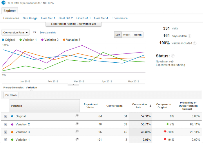
One of the best ways of increasing your conversion rate is to split-test aspects of your website to see what’s actually working. You can play the guessing game all you want but it’s hard to beat data.
To split test certain pages on your website, you can use a tool like Google Content Experiments (found inside Google Analytics). This allows you to create two different versions of your page, one with a slightly modified element. The tool will direct 50% of the traffic to one page and the other 50% to the second page. The page with the higher conversion wins!
The most important elements of your website you’ll want to test are: your page headline, the layout of your website, your call-to-action, any colors that are used, any media used, and overall layout of your content.
4. Ensure You Have an Active Sales Funnel
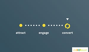
You need to be sure you’re asking for the sale at the right phase of the buying cycle. Sometimes, when a visitor lands on your website they aren’t ready to buy from you yet. When you push for the sale too soon, you risk making potential purchasers uncomfortable and driving them away from your site.
Many sales processes benefit from slowing things down a touch, providing value and building trust before you ask customers to put money on the line.
The best way to build trust and showcase your expertise is by implementing the repeatable process below:
- Create consistently valuable advice through your blog and other forms of content.
- Offer a free report, or other valuable offer, in exchange for an email address.
- Give users valuable content via email over time.
- Ask for the sale.
5. Build a Higher Degree of Trust
We only buy things from people we trust. By incorporating specific “trust builders” into your website, you’ll increase your chances of your customers taking the desired action. Here are some evergreen options:
- Showcase customer support in the form of testimonials, social proof, and case studies.
- Highlight your expertise by linking to any third-party organizations, local groups or relevant publications that have vouched for your company in the past.
- Include anAbout page and provide multiple means of contacting your company directly.
- Show visitors you’re approachable with realistic company and staff photos and make sure your site projects a professional air.
6. Simplify the Decision Making Process
Your goal should be to make taking action as simple for your visitor as possible. The highest converting websites are those which are the most intuitive and easy to use. Could someone with very little technical knowledge sign up for your newsletter? Or schedule a free consultation? Use the tips below to nudge your website in the right direction:
- Hold your visitor’s hand: Always guide your users towards the action you want them to take. Leave nothing up to chance. Make the next step the easiest and most logical step to take.
- Make it easy to sign up: The less fields you require from your visitor, the better the chances of them filling in a sign-up form. When you’re asking users to fill out an opt-in form, try to reduce required form data to the absolute essentials.
- Minimize your visitor’s options: The more choices you ask your users to make, the more likely it is they’ll do nothing at all. Make it easy on your visitors by limiting the number of options put before them at any given time.
7. Utilize Proof Wherever Possible
Whenever you make a claim about a product or service you need to back it up with some kind of proof. The larger the request you’re making, the more proof you’re going to need.
For instance, if you’re trying to get a user to part with their email address, a simple testimonial from an authority or past customer will do. If you’re looking for them to purchase, more might be required.
When you’re trying to get your visitor to take a higher-level action, you’re going to need to provide more evidence. Some solid methods of doing this include:
- Testimonials from past customers who’ve already achieved stellar results using your product or service.
- Before-and-after case studies from customers.
- Results from studies which support your claims.
- Number of followers or subscribers (if the numbers are large enough).
8. (Bonus) Remove All Distractions
If you’re distracting users with pop-ups, sidebars and too many requests, your visitor won’t be able to focus.
The more visual distractions you have, the harder it is for someone to make a decision. If your website utilizes any landing pages, or special consulting or service pages, then consider removing the following elements:
- Unnecessary navigation menus.
- Any sidebars or distracting headers.
- Images and videos that aren’t associated with your product.
If it’s not directly related to the topic of the page, remove it.
In Closing
Increasing your conversions doesn’t have to be difficult. However, it does require an in-depth understanding of your customer and the ability to consistently experiment.
Remember, optimizing your conversion rate is a long-term game. Over time, you’ll learn more about your market and you’ll be able to react ever more swiftly to better serve your customers’ needs.
By implementing a few of the tricks above, you’ll be able to create an optimization strategy that evolves with your business over time and substantially boost profits.
Any conversion tips we missed? Share your favorite ones in the comments below!


