Designing a Responsive Website for SEO: A Business Owner’s Guide
You already know it is hardly optional to make your site mobile-friendly, but you still aren’t positive how to go about using it on your site. What’s a business owner to do?
‘Mobile-friendliness’ is a ranking factor in search because Google believes it creates the best user experience. Therefore, going responsive can be an effective way to boost your rankings while improving mobile visitor bounce rates. Thankfully, going responsive doesn’t have to be difficult.
With the above in mind, in this article we will show you exactly what to look for when choosing a responsive design for your WordPress website, and how to optimize it once it is installed.
What is Responsive Design?
Responsive web design is an approach to building websites that uses the same code to deliver a unique experience to users on devices of all sizes.
The HTML and CSS (i.e. the code that drives your websites) is the same across platforms, but the design is adjusted based on screen size. There are so many devices out there that it’s impractical to design for specific screen sizes and resolutions anymore – hence the popularity of responsive design.
There are two alternatives to responsive design for building a mobile-friendly site:
- Dynamic serving. This means your website detects whether a device is a mobile phone, and serves different HTML and CSS accordingly.
- Separate URLs. Your users must visit a unique URL to access a bespoke mobile-friendly version of the site.
Though it is not the only option, responsive design is our recommendation. Perhaps more importantly, it is also Google’s preference. With mobile-friendliness as a ranking factor, here is how to get started setting up your responsive site for SEO.
Choosing a Responsive WordPress Theme
Unless you have a dedicated web design team, chances are good you will want to find an existing responsive WordPress theme for your business. You should give this process its due attention, or you will waste a lot of time trying to customize the wrong theme for your business.
Where to Source Your Responsive Theme
WordPress.org is the official directory for WordPress themes, and it is entirely free. To find responsive themes, make sure you search for them specifically, as it is not (yet) a requirement in the directory.

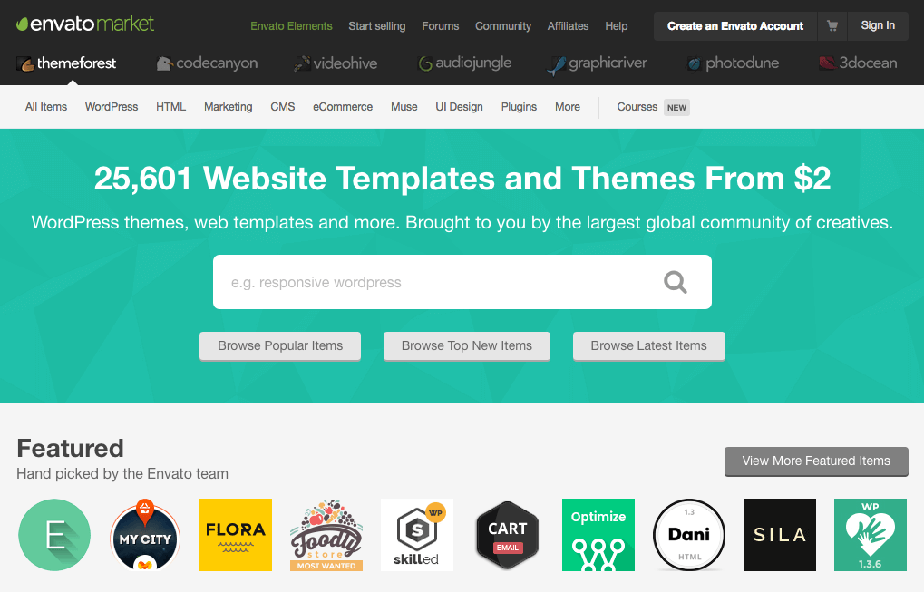
There are also marketplaces that gather together free and premium WordPress themes. ThemeForest is one of the most popular for finding quality premium themes.
If you want a more all-in-one solution, consider theme frameworks. Frameworks are themes that create a strong foundation of WordPress friendly code. Developers then design their own unique designs (known as ‘child themes’) built on top of these frameworks.
Two successful examples to begin your search with are Genesis and Divi.

How to Pick a Good WordPress Theme
Not all WordPress themes are born equal. There are a few things to keep in mind when selecting one for your business:
- Simple themes are usually easier to work with.
- Check for browser compatibility listed on the theme. You can compare this to your current site analytics to ensure your users’ browsers are compatible.
- Find out if it supports the plugins your business currently uses. If you’re not sure, ask the theme’s developer.
- Find out whether the theme uses a built-in page builder. If it does use a page builder, make sure it is a standalone solution that can move with you if you ever change themes.
- Run its demo through the W3C Validator to make sure it passes reasonable HTML standards.
- When it doubt, check user reviews to get a feel for the experiences others have had with the theme.
How to Test Responsive Themes for Quality
Once you find a responsive theme you think will work, it is time to test whether it will perform as expected.
Responsive design means different elements change shape, size, position, and visibility. To find out how your theme of choice handles these changes, demo the theme on your desktop, tablet, and mobile phone.

[Tweet “Responsive design means the entire site changes based on screen size. Test before choosing a theme!”]
You are looking to find out what different sizes are supported by the theme. Responsive themes are usually optimized for two to three sizes. Browser tools like Resizer set your desktop browser window to match common device sizes, which will help you determine what the theme is capable of.
- Start by using a browser resizing tool to see what views the theme is optimized for. It should look and feel usable at mobile, tablet, and desktop sizes.
- Watch how the menu changes at different sizes. The menu often changes look and behavior on mobile. How does it change? Is it something that works for your needs?
- Layouts usually go from a wide layout with many elements side by side on desktop, to a one column display for mobile. Check for the order the content goes in on mobile. Post and page content should stay accessible at the top of the page, while secondary elements (like the sidebar) stack beneath.
- Test how video reacts to sizing changes. Check this from your actual mobile phone. Try to scroll through a page with video. Make sure it shows correctly and doesn’t give you any problems when you play it.
Configuring Optimal SEO Settings for Your Responsive Website
Once you have settled on a responsive design that works, it’s time to optimize it for SEO. You’ll do this using an SEO plugin. Our favorite is Yoast SEO, because the free version supports the most effective options for positively impacting SEO results right out of the box.

Here are the essential settings to get you started.
Connect your site to the Google Search Console. This will help you track the keywords leading traffic to your site. You’ll find this under SEO > General > Webmaster Tools in the WordPress admin.

Fill out your company information. Yoast SEO provides structured data, which makes you eligible for inclusion in Google’s Knowledge Graph. Navigate to SEO > General > Webmaster Tools.
.webp?width=621&height=475&name=company-info-yoast%20(1).webp)
Check the page title defaults. Make sure you’re happy with the formatting and customize as necessary. This is under SEO > Titles & Metas.

Add your social media account information. This is another feature that adds structured data to your site behind the scenes, which makes for better attribution in search and on social media networks. Check SEO > Social for these settings.

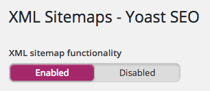
Finally, when everything else is ready to go, make sure the sitemap is enabled under SEO > XML Sitemaps. You can submit this to Google Console to make sure Google is always up to date on your site’s current published pages.
Conclusion
Going responsive can feel like an overwhelming task, but it doesn’t have to be this way with our tips above.
There’s always more to do, however. If you’ve picked out a theme and optimized it as per our instructions above, the next step we’d recommend you take in terms of boosting your site for SEO is optimizing it for speed.
What questions do you still have about picking out a responsive theme and optimizing it for SEO? Tell us about your struggles in the comments below – we’re here to help!

